Tools & workflow
Do we still need Articulate?
What building Ag Dirt Busters made me reconsider about authoring tools, custom development, and the work that follows the first build.
2 min readRead article
Insights
Learning design, AI-assisted development, and the decisions behind the finished experience. Practical perspectives from the work at Sagebrush Design.
Tools & workflow
What building Ag Dirt Busters made me reconsider about authoring tools, custom development, and the work that follows the first build.
Learning design
How a shared structure supports new agricultural topics while leaving room for the learning decisions each one requires.
Review & revisions
Wording, navigation, visuals, and reporting all needed review. Each revision helped clarify what the experience had to do.
From ideas to project work
AI-assisted development has given me more ways to build interactive learning. Developing Ag Dirt Busters made me look more closely at when I reach for Storyline or Rise 360, and what I need an authoring tool to make easier.
I have used both tools in my instructional design work. For Ag Dirt Busters, I chose a custom web approach to connect public interactive experiences, audience options, a reusable structure, and reporting. That choice expanded what I could build. It also brought revisions, testing, and troubleshooting.
The project serves people exploring agricultural questions outside a typical workplace course. The experience needs to be accessible from a public link, support Kids and Grown-ups versions, and connect activity to the relevant topic and source. Those requirements helped shape the development approach.
A different project might need an LMS package, a familiar stakeholder review process, or source files that a client’s existing team can update. Those requirements deserve equal attention.
Rise 360 supports LMS exports and Review 360 feedback. It also supports code blocks, so custom code and an authoring platform can be part of the same solution. The choices continue to evolve.
In Ag Dirt Busters, a functioning interaction did not settle every question. Images needed to fit their containers. Navigation needed to make the next action clear. Reporting needed defined metrics and checks against the underlying records.
AI helped support development and revisions. I still had to specify the behavior, evaluate the content, review the output, and decide whether the result met the need. A polished prototype is a useful step; delivery requires checking the whole experience.
I would consider Storyline or Rise 360 where their workflow, delivery options, and client familiarity fit the project. I would consider a custom build where the public experience or integration requirements justify the ongoing development responsibility. A combination may also fit.
The useful question is what approach serves the learner, the organization, and the person maintaining the work. Building Ag Dirt Busters gave me a practical way to examine that question.
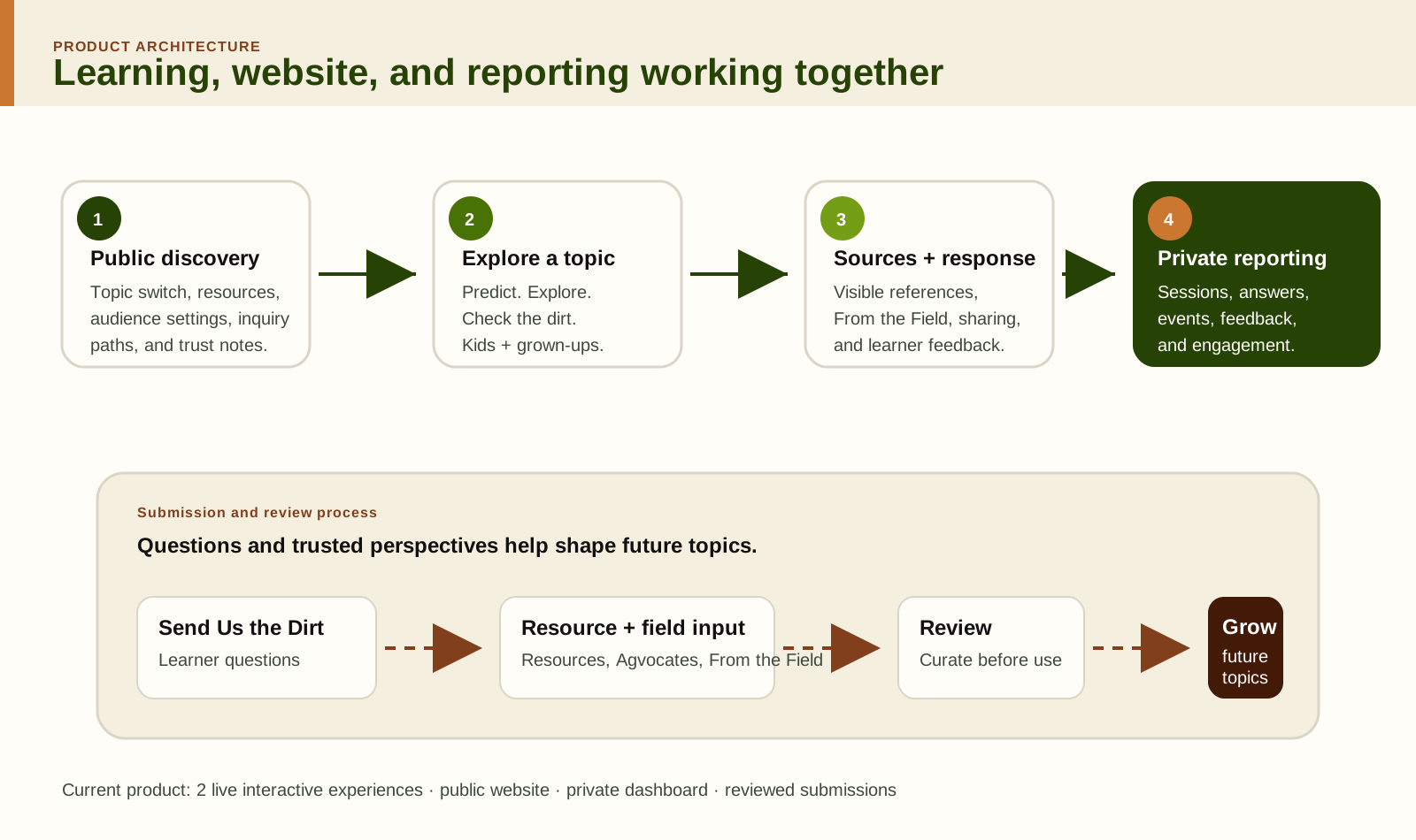
A reusable template carries the structure of an experience: how people move through it, where evidence appears, and how the work is reviewed. The visual treatment is one part of that structure.
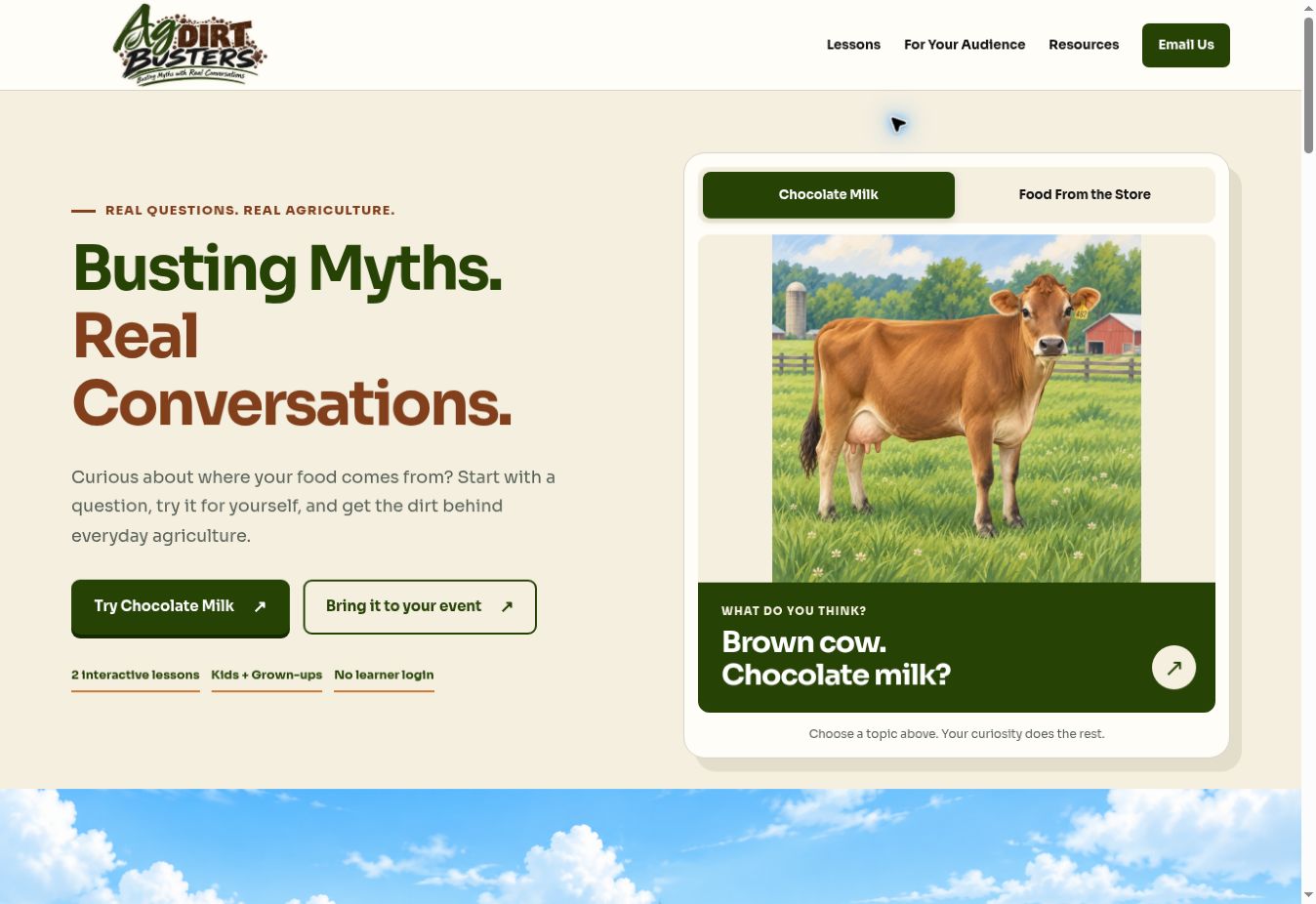
For Ag Dirt Busters, I wanted a consistent foundation for exploring agricultural misconceptions. Chocolate Milk and Food From the Store provided concrete topics to build and refine that foundation.
The learning goal is to help someone understand the evidence and put the takeaway into an everyday conversation. That goal influences the opening question, the interaction, the explanation, and the final response.
The shared structure makes room for evidence, agricultural perspectives, learner feedback, supporting resources, and ways to suggest future topics. Each section needs a purpose in the experience.
Kids and Grown-ups receive the same core factual answer. The language, amount of context, imagery, and source detail can change to support each audience. Adapting a version requires reviewing how it reads and works from beginning to end.
Consistency also matters in the controls. Familiar buttons and a clear restart path help people understand what they can do next without relearning the interface for every topic.
The topic-specific explanation, activity, images, and evidence still need individual decisions. A familiar misconception and a nuanced agricultural claim may require different practice or more careful wording.
A new topic should be checked for factual accuracy, reading level, interaction behavior, image fit, links, and the data it sends. Reusing a structure makes those checks easier to organize. It does not remove the need to perform them.
For this project, GitHub holds the source, Netlify hosts the web properties, and Supabase supports interaction data. Those tools serve different parts of the system. Connecting them requires checking that the content and reporting refer to the same topic.
The template creates a consistent starting point and a clearer basis for review. It helps me preserve established behavior while spending attention on the parts that change for each topic.
That is the value I look for in reusable learning design: a foundation that supports judgment as the work grows.
The Ag Dirt Busters build included repeated reviews of content, visuals, interactions, and reporting. The useful story is the reason for a change and the evidence needed to judge it.
A change can look small on screen and still matter to the learner. A sentence can suggest an unintended conclusion. A button can invite an action before someone has made a selection. A report can display a number without explaining what it represents.
Agricultural topics can lead into many related questions. During review, I kept returning to the misconception the experience was meant to address. Supporting detail had to help explain that question at the appropriate depth for the audience.
That also meant revisiting wording. When a phrase could suggest a broader or stronger conclusion than the evidence supported, it needed attention. Subject matter review helps identify those implications.
The shared structure needed consistent controls, appropriate section access, and a clear restart path. These decisions affected how someone moved through the experience and how it would feel on a shared device.
Review included whether the learner had made the selection needed for an activity, whether the next step was available at the right point, and whether the experience could be started again.
A useful image still needs to work inside its container. Cropping, proportions, legibility, and the relationship between text and buttons all affect the experience. Reviewing the rendered page on different screen sizes revealed details that the source alone could not settle.
Keeping the established branding also gave revisions a consistent reference. A visual change needed to support the purpose of the section and fit the surrounding experience.
The dashboard work required attention to metric definitions and filter behavior. A share-button selection indicates share engagement. Confirming an actual share requires additional evidence. A correct final response gives information about that immediate response; it does not establish retention.
Checking totals against records and testing filters are part of making reporting useful. A successful deployment alone does not confirm that every view is accurate.
That process keeps review grounded in the work. It also helps distinguish a design preference from a content, usability, or data issue.
The revisions are part of the case study because they show the judgment needed to bring the pieces together.